
DIGIPACK ANALYSIS TAYLOR SWIFT ALBUM: 1982
The album is named after Taylor’s year of birth as well as the pop scene throughout the 1980s. 1989 sold 1.287 million copies during the first week of release and it eventually became the best-selling album in the US for 2014. In both Germany and the UK, the album was released to wide retail and digital download - The 1982 album still has the 1st place in the Taylor's Swifts albums.
DIGIPACK ANALYSIS TAYLOR SWIFT ALBUM: 1982
What conventions of a CD Cover / Digipak does it include / leave out?
FRONT COVER
-
COLOUR - The colour of the front panel is a very warm and soft colour with a positive connotation. This may reflect the overall mood of the songs on the album. In the photo you can see Swift wearing red lipstick. This is one of her signature looks that has become known in her fandom and society. She mentions her iconic appearance in several lyrics. By displaying this on her album cover, she shows that despite the fact that her own music has changed, she still remains the same. This is intended to alleviate her fans' anxiety about the sudden switch in music from country to pop.
-
WORDING - The fact that the title is handwritten gives the album a personal feel, making Taylor seem like a real person and making the audience like her. I was chosen because I was young. It also makes the album more personal as the dates are artist specific.
-
DESIGN & LAYOUT - Polaroid photos are relatively outdated. This can be done to represent Swift's era in the music industry, and the fact that she's not fully featured on the album's cover is more of an indie rather than a typical pop convention for her genre. It's a convention of her genre.
.jpeg)
-
FONT - According to my research, this font isn't a font, it's handwritten, and it's Taylor Swift herself who created it.
-
CHOICE OF IMAGE- This differs from previous albums that show her full face. This could indicate that she is trying out new approaches for her in transitioning from country to pop music. Taylor already has an established following who can tell if the album is hers, so she doesn't have to appear on the album cover.
-
COLOUR - The song titles on the back appeal to a wide audience as they are not aimed at men or women. The back image is a continuation of the front image, showing the rest of Swift's face. This shows off her makeup, which is relatively natural aside from the eyeliner. This is also part of Taylor's signature red lipstick and eyeliner look, which once again shows the audience that she remains the same even as her music changes.
-
FONT - The font that has been used for the song titles as well as the record label information is reminiscent of the font that a type writer uses.
-
CHOICE OF IMAGE - In the back cover you can see the face the missing face from the front cover.This and the fact the image is a Polaroid photo links to the idea of old technology which gives the album a vintage vibe. This is smart due to the sudden increase in popularity for old and vintage technology such as record players and Polaroid cameras.

BACK COVER
-
CHOICE OF IMAGE - In the back cover you can see the face the missing face from the front cover.This and the fact the image is a Polaroid photo links to the idea of old technology which gives the album a vintage vibe. This is smart due to the sudden increase in popularity for old and vintage technology such as record players and Polaroid cameras.

Featuring birds in flight, they reinforce their idea of creative freedom with this album. The CD uses the same front and handwriting on the front and back. This adds an even more personal touch to the album, as if she herself wrote her CD. Sharing the same colour scheme as the rest of the Digipak, the style is consistent across her CDs and reflects the same vintage vibe. The edge of the CD contains the album's copyright information. This is a general Digipak convention.
TAYLOR'S SWIFTS. ALBUM - 1982 DIGIPACK FORMAT
-
Simple format
-
A four page insert
-
4.75 x 4.75

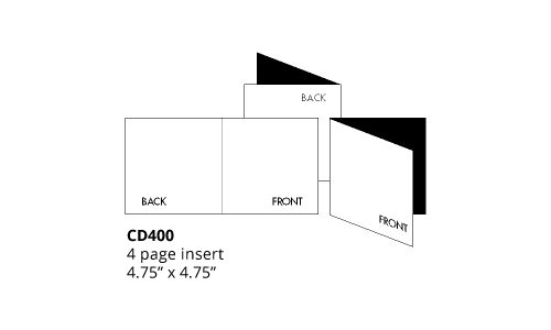
Simple format - Almost all the Taylor's Swifts albums have this type of format - Why, maybe because she likes the simplicity of the cover because then she likes to add extra details just like the FotoAlbum she includes In the album - She says the feeling of being in-love. Below
TAYLOR'S SWIFTS. ALBUM - 1982 DIGIPACK FORMAT
The 1989 Digipak contains 13 collectible Polaroid photos. Taylor can be seen on all Polaroids, some of which look very similar to the images on the front of the digipaks. These photos suggest they weren't featured on the cover.At the bottom of the Polaroid, the lyrics to the songs on the album were handwritten. The fact that they are handwritten makes the album more personal. These images are similar in style and tone to the front and back images, creating a sense of continuity throughout the digipak.
PHOTO ALBUM - Inside the DIGIPACK - Right next to the disc- Relates to being in love
 |  |
|---|---|
 |  |
 |  |
 Describe your image |  |
 Describe your image |  |
 Describe your image |  |
 Describe your image |  Describe your image |
 |